|
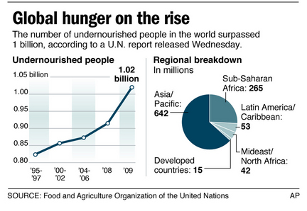
This graph shows that global hunger is getting progressively worse. In 1995-1997 there were around 0.82 billion undernourished people in the world, which has escalated up to a daunting 1.02 billion undernourished people in 2009, and it is only going to get worse unless we act. We can see this data on the graph to the left of the image titled “Undernourished People”. We can see on the pie chart to the right of the image titled “Regional Breakdown in Millions”, that Asia/Pacific has the most horrible hunger numbers with a frightening 642 million people undernourished. The second worst is in the Sub-Saharan Africa with an alarming 265 million undernourished people. Other places in the world such as Latin America/Caribbean (53 million), Mideast/North Africa (42 million), and developed countries (15 million) have a combined number of 110 million undernourished people. These numbers are only going to grow if we don’t do something about it.
|
“Global Hunger on the Rise” Graph
Analysing Global Hunger Graph
